CYBRAICS
Network Security Web App
Tool: Figma
Time frame: May 2021- January 2021
Deliverable: Hi-fidelity Mockups, Prototypes
Platform: Web-based application
Team: remotely worked with PM and front-end devs
BACKGROUND
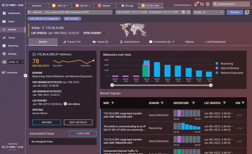
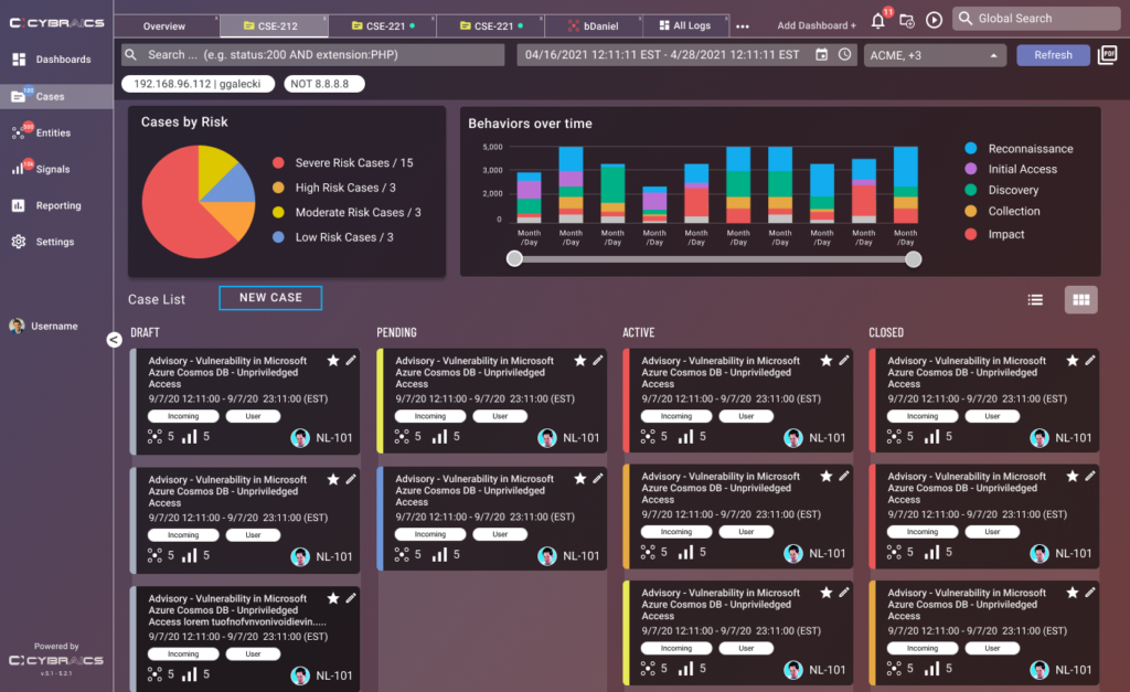
As UX and Visual Designer at network security company Cybraics, I worked as a part of the team that redesigned and built their flagship product called nLighten. nLighten helps manage security threats through Case Management along with monitoring Entities (IP Addresses, Domains, etc.) and Signals (A series of behavioral events like Malware). Thanks to new technology and greater customer feedback, the goals of this project were to emphasize visualizations and customizations along with new user management and reporting features. On this project I worked with our Product Manager, and UI Developers.
With this newer update of the product, we needed to provide a solution towards providing a more updated visual design, better visualizations for the data, and more customization for the customers so that they could better tailor the product to their needs.
CONCEPTS
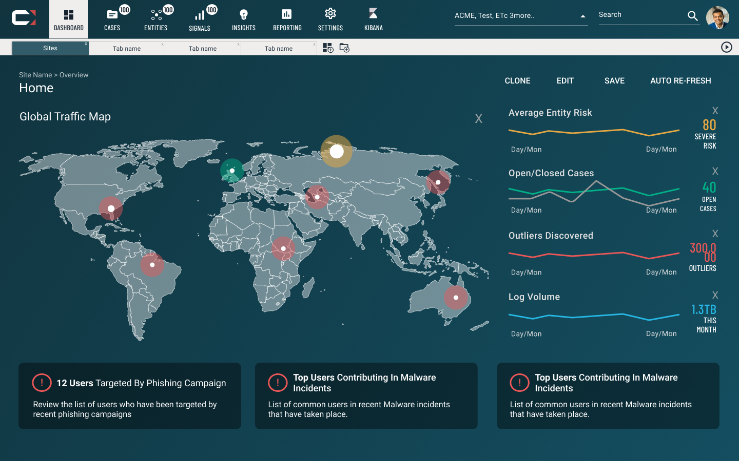
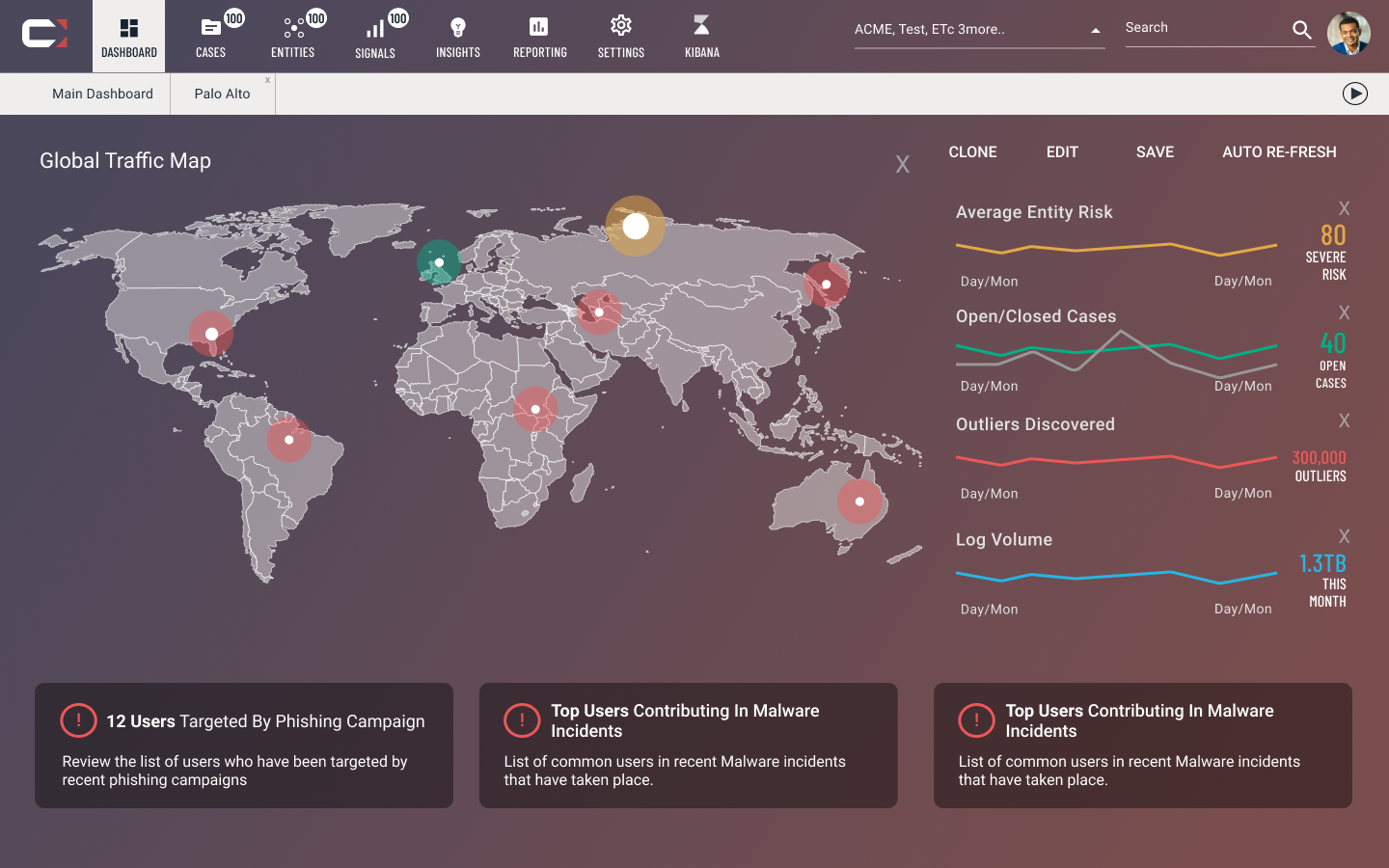
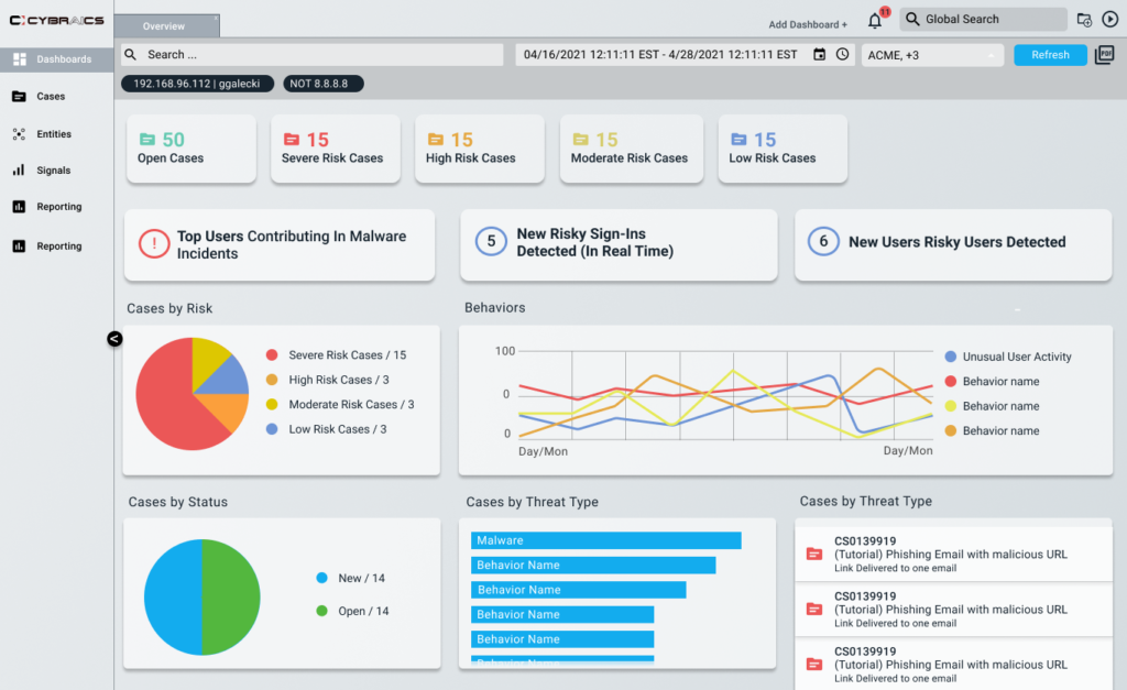
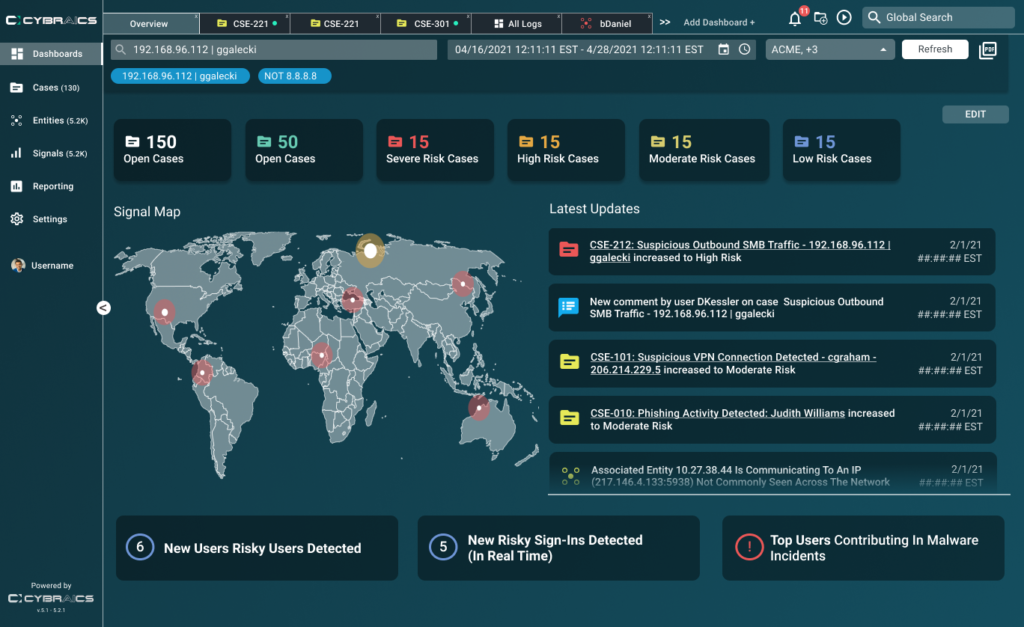
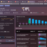
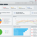
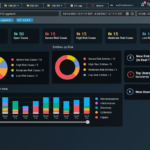
As the project had begun to be scoped out with our team, I began to research what some of our competitors were doing, how the successful they were, and visual concepts that would be visually engaging along with the data shown. Our product manager wanted a “floaty” look and feel. I interpreted this as being a more minimalist layout with a gradient background to help soften the look and feel and avoid a flat look considering the fact some users look at these screens for a long time.
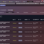
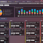
I began to mockup a few concepts based off of existing data and some of the features we were planning to implement, one of which would be a tab based layout. These concepts were also meant to indication new theme options that would be available to the customer that they could further customize.
ITERATION
As designs were being fleshed out, I ran meetings without team that included other security experts and customers, to gather feedback on the designs and further flesh them out based on their needs on how they might use the product. I would build out prototypes in order to give a more hands-on feel for how this product would flow and be used in order to gain more specific feedback. We went through a couple of cycles on this until we arrived at a design we felt addressed all to the needs of the project.
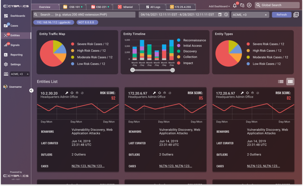
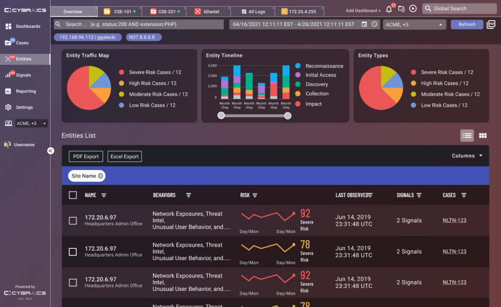
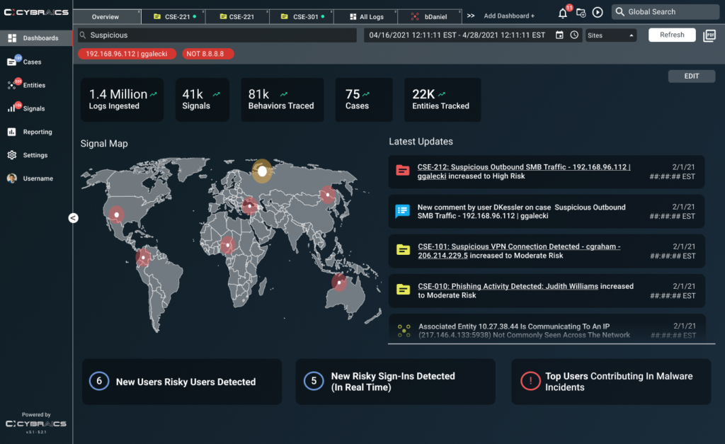
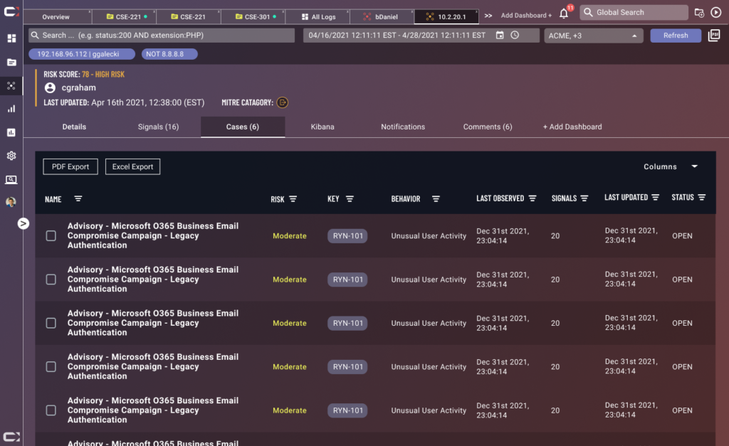
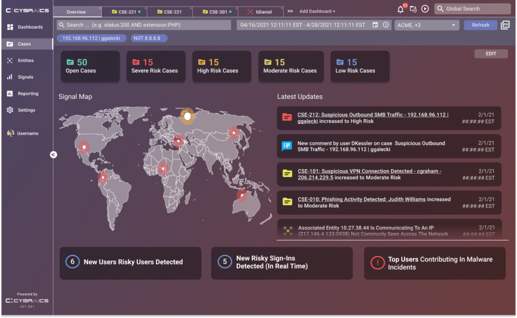
One of the main areas of feedback was where the navigation was positioned. We originally designed it with a top level main navigation and tab bar in order to better accommodate space for new visualizations and data. Working with the dev team, we were able to iterate further into a collapsable left nav that would provide a bit of consistency from the previous version of the app, while being able to still provide more space.
VISUALIZATIONS FEATURE
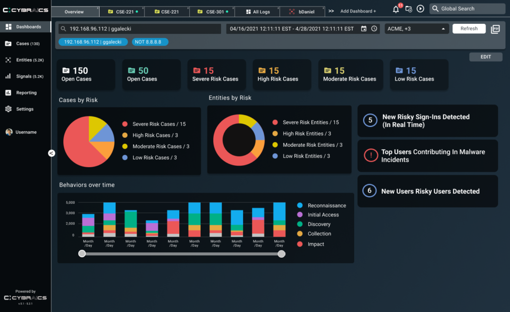
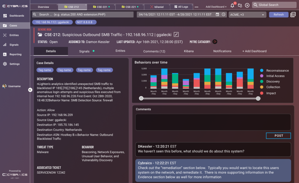
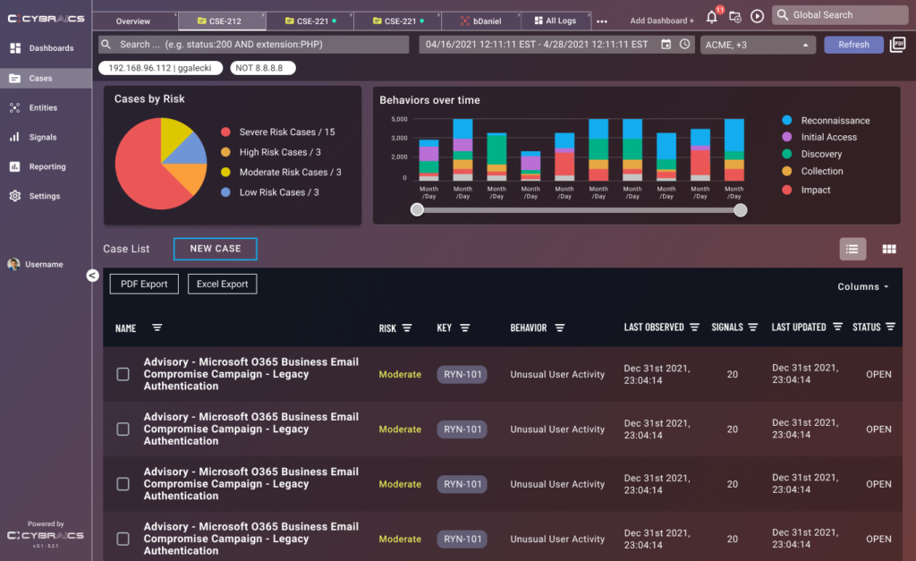
With improved and interactive visualization incorporating a client’s data, the user can use them to broadly measure what is occurring in their system across the Case, Entites, and Signal metrics in order to better manage possible threats.
CUSTOM THEME FEATURE
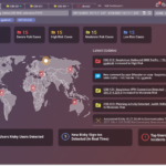
One of the big goals of this project was to offer a higher level of visual customization. A user can select a theme along with choosing a custom primary color in order to brand their own environment
FINAL DESIGN
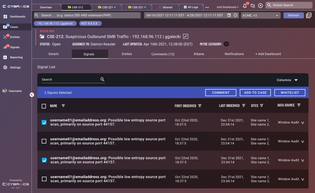
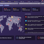
After a final round of iteration, we cemented a new layout that accomplished our original goals while adding new features. With the collapsable left sided navigation, we were able to maintain the focus on visualization with the added screen space and at the same time give our users the visibility of the navigation they preferred. We firmed up a lot of the design components and on the tabs themselves, we added corresponding icons to give better visibility of the status of those pages at it pertained to risk and status updates. We fleshed out the new themes that would be provided as well.
CONCLUSION
This was definitely one of the biggest projects of my entire career and one that made me realize even when you finish the first iteration of a project, your designs are still evolving. As new features kept getting scoped out for the product, I learned to show how necessary a shared design process is to those on my team. I pushed back against things that would have made the visual design more inconsistent while accommodating new changes and features that was out of scope. Currently we are working on polishing the new design in a new update and gathering new feedback for the product.
