THE BEE COLONY
Website Redesign
Time frame: September 2018
Deliverable: Hi-fidelity Mockups and Assets (icons, images etc.)
Platform: Web Site
Tool: Sketch and Photoshop
Team: Worked with Client, Company leadership and front-end devs
BACKGROUND
The Bee Colony is an organization that helps assemble charities. They were working with Jarrell Systems who I was doing contract work through as a designer. The purpose of this site was to be a platform of messaging and services that it provided. The main goals of the project were to establish a more identifiable visual brand and layout for their new site.
CONCEPTS
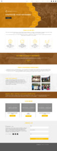
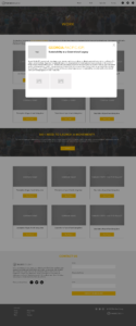
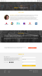
Starting this project began with personally meeting with the client to discuss the goals and what needed to be achieved. This was a personal project for the client and the design itself would have to be a vessel for the organization’s mission statement and function. Based off of our conversations, feedback, imagery and messaging they provided, I began to create a few concepts that reflected all of this and gave them something more substancial to iterate on.
ITERATION
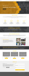
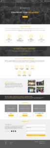
Using the feedback from the concepts, existing branding and messaging and working along side my team with this process, I was able to further develop the look and feel of the site that went into a final and approved design.
FINAL DESIGN
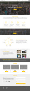
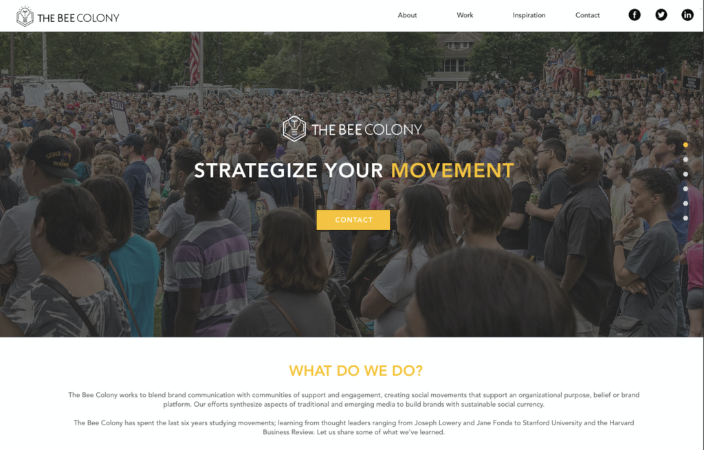
This last iteration further emphasized the messaging of the company while establishing a more modern aesthetic and style more unique to the company. The site would be used as a jumping off point for potential customers to get an estimate on possible projects, examine previous work, and to get to know the company itself. These hi-fidelity mock ups were built through sketch and were used to help build the site for developers. This final design also included new icons, new layouts for all of the project pages to help guide the developers to successfully build it.
DELIVERABLES
CONCLUSION
Ultimately this was a really fun project to be apart of, working with the leadership to help build out their visual brand and identity. The designs were well regarded and helpful in further establishing the capability of the agency. Some of what I would have done differently would be to show more variety in the color scheme and layout but this was meant to be a straight forward site in it’s first iteration, which it was successful in.
