JARRELL SYSTEMS
Website Redesign
Time frame: November 2018
Deliverable: Hi-fidelity Mockups and Assets (icons, images etc.)
Platform: Web Site
Tool: Sketch and Photoshop
Team: Worked with company leadership and front-end devs
BACKGROUND
Jarrell systems is a development agency that I did contract work with. One of the projects I did for them was a redesign of their website, establishing more of a visual brand in order to help better market themselves to potential customers. I worked primarily as a visual designer on this along side company leadership, investors and then as a resource to developers.
CONCEPTS
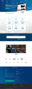
Working with company leadership and using their existing branding, I used that as a foundation to establish a stronger visual identity and look for the company. I created a few concepts to gather feedback from company leadership and investors to flesh out what could be used to build their new site. We went through a couple of iterations before it lead to the final design.
ITERATION
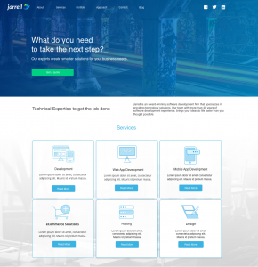
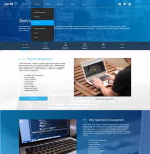
Using the feedback from the concepts, existing branding and messaging and working along side my team with this process, I was able to further develop the look and feel of the site that went into a final and approved design.
FINAL DESIGN
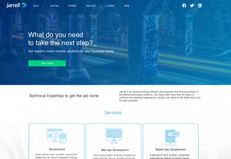
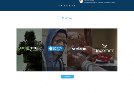
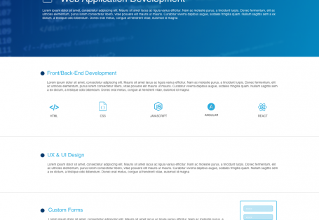
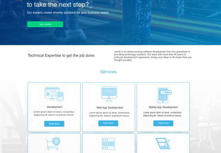
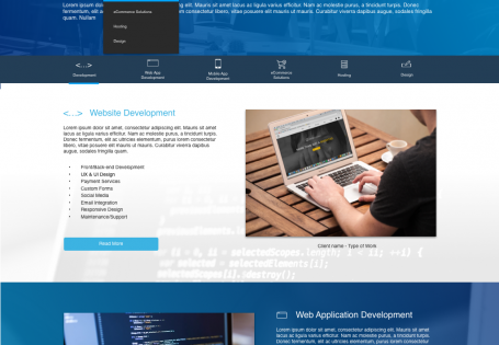
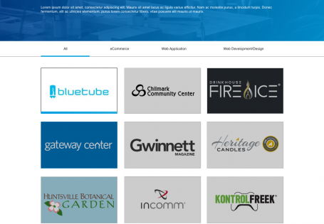
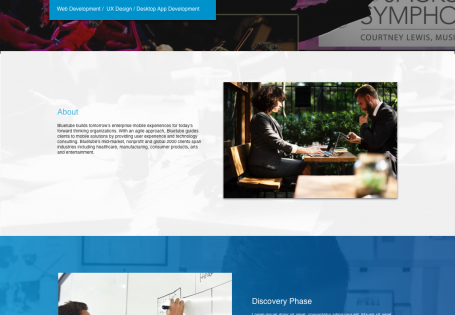
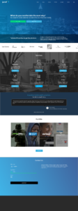
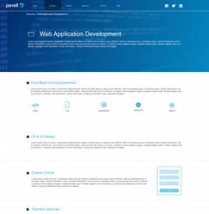
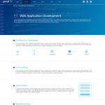
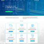
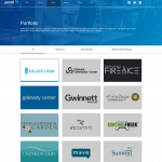
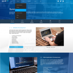
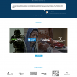
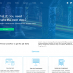
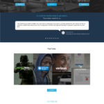
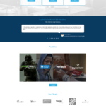
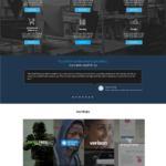
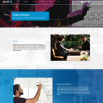
This last iteration further emphasized the messaging of the company while establishing a more modern aesthetic and style more unique to the company. The site would be used as a jumping off point for potential customers to get an estimate on possible projects, examine previous work, and to get to know the company itself. These hi-fidelity mock ups were built through sketch and were used to help build the site for developers. This final design also included new icons, new layouts for all of the project pages to help guide the developers to successfully build it.
CONCLUSION
Ultimately this was a really fun project to be apart of, working with the leadership to help build out their visual brand and identity. The designs were well regarded and helpful in further establishing the capability of the agency. Some of what I would have done differently would be to show more variety in the color scheme and layout but this was meant to be a straight forward site in it’s first iteration, which it was successful in.
